We typically understand responsive design as being fluid grids, flexible images and media queries - these being the elements detailed in Ethan Marcotte's original A List Apart article on responsive web design.
Over the last few years however we have been handed a whole set of new tools in CSS which allow our sites to respond to the environment of our user, and the shape of the content we are displaying. In this talk I will take a look at how new layout supports flexible grids and content-based sizing. I'll share how the new generation of Media Queries are about so much more than just viewport size, and how we can use the tools we have to really place the person using our site at the heart of the decisions we make.
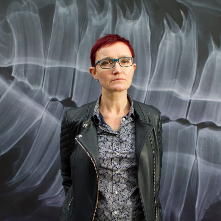
About Rachel
Rachel Andrew lives in Bristol, England. She is one half of web development company edgeofmyseat.com, the company behind Perch CMS and Notist. Her day to day work can include anything from product development to devops to CSS, and she writes about all of these subjects on her blog at rachelandrew.co.uk.
Rachel has been working on the web since 1996 and writing about the web for almost as long. She is the author or co-author of 22 books including The New CSS Layout, and a regular contributor to a number of publications both on and offline. She is a Google Developer Expert for Web Technologies a member of the CSS Working Group, and Editor in Chief of Smashing Magazine. Rachel is a frequent speaker at web development and design events including An Event Apart, Smashing Conference, and Web Directions Code.
Rachel is a keen distance runner and likes to encourage people to come for a run when attending conferences, with varying degrees of success. She is also a student pilot and aviation geek. You can find her on Twitter as @rachelandrew.